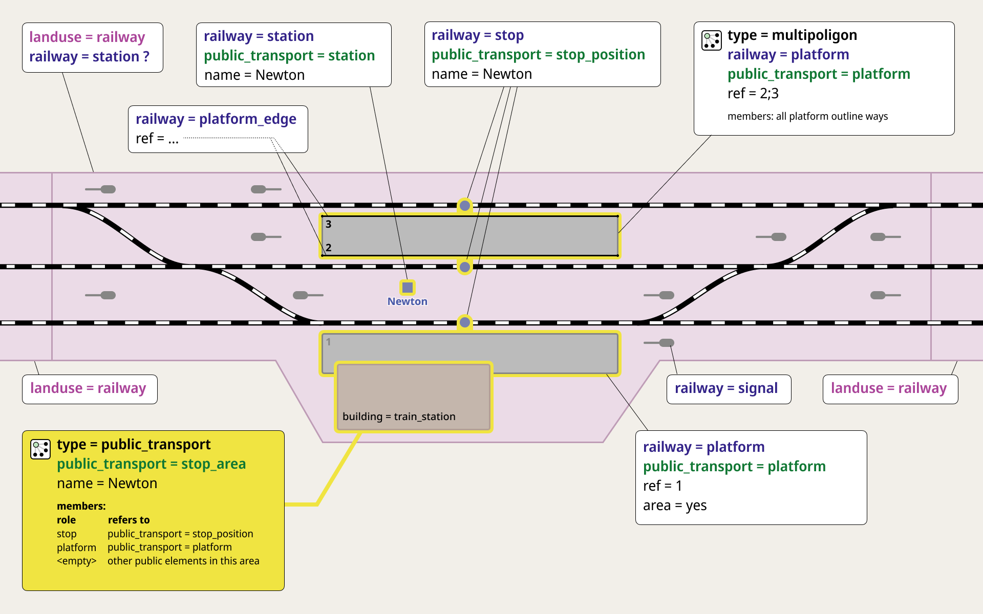
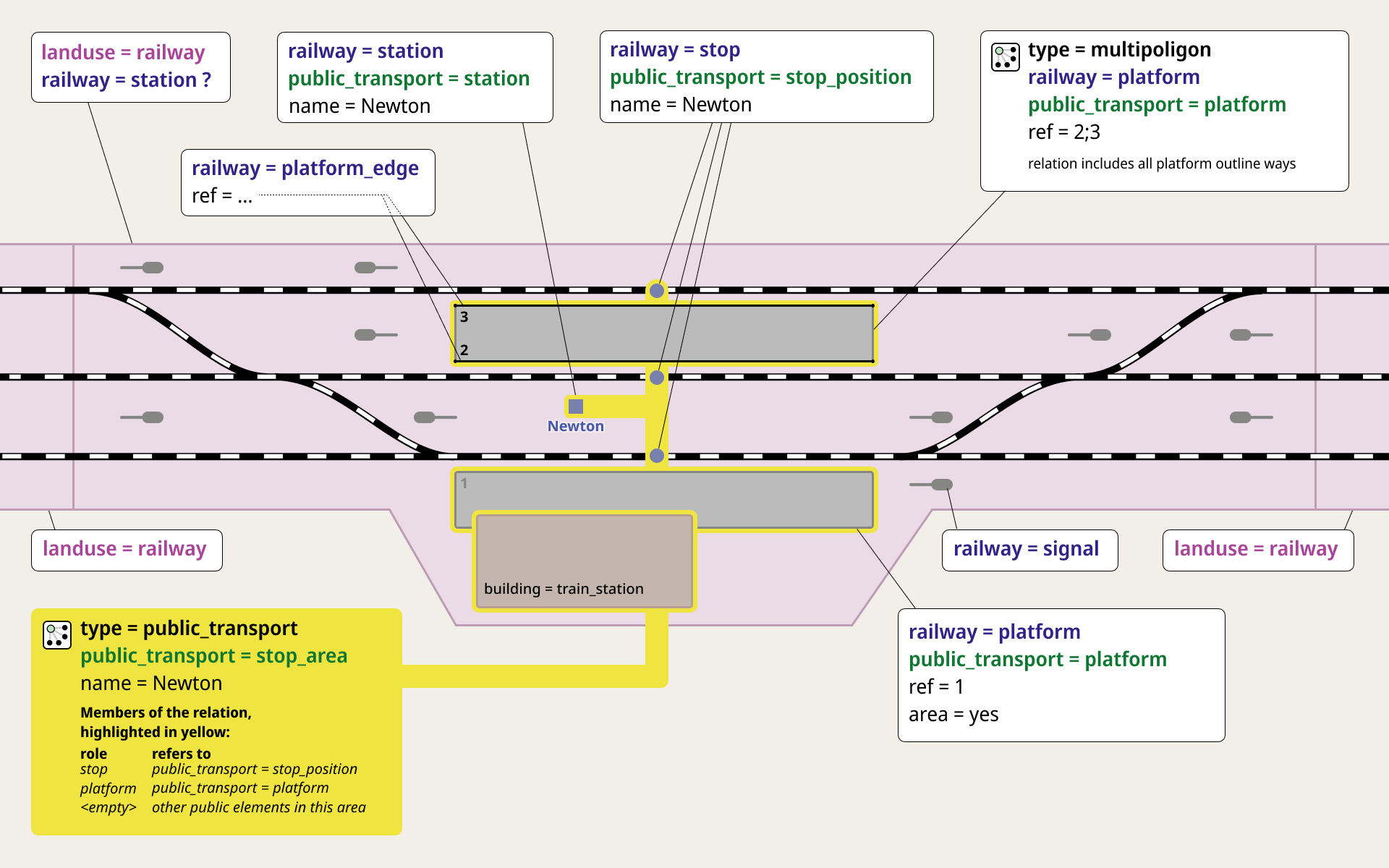
The diagram does get more complex, the diagram does get more complete. There does come a point where we truly must say “enough is enough.” I thought we were there a couple iterations ago, but maybe (figuratively speaking) with a bit of a burp and digesting these new, most-recent features, we are at a tippy-top of “enough is enough” with this diagram.
I still don’t quite understand how railway=platform_edge is described by this diagram, meaning I would have to go look that up and view another diagram to visualize the specifics of those. So, maybe not, but others might like this, I don’t know.
I welcome more input (for example, strategies on how to describe that an area:railway tag might be needed in complex landuse cases…), but I would find additional features / more additions to be “simply too much.”
Again, we are pretty close, but I personally would like to see the opinions of others as to the effectiveness of this (latest) diagram. Personally, I find it “one course too many in the chef’s wonderful, though very full meal” (or a run-on sentence, take your pick), but now that @tordans has what he likes, he offers a thumbs-up. That is understandable (I was happy when I saw my features there, people get happy when they see their features…), but the question remains: are we all happy with this (latest) diagram?
Maybe one additional question remains: I honestly don’t know the answer to @TangledRockets question about the true extent of signals defining landuse. I assumed that was true (and it seemed to be so with a couple quick checks I did), but there may be (much?) more to it than we have diagrammed here. Still, I like the simplicity of this, and if there are rare corner cases, we should “leave as is” and note somewhere else that there may be exceptions (like Ferencváros).
I appreciate the diligence of all who participate and the spirit of collaboration here, it’s wonderful!