@dieterdreist, what’s your opinion on it?
Our pretty diagram above has made the news! It is the “headline graphic” in weeklyOSM 770 – weekly – semanario – hebdo – 週刊 – týdeník – Wochennotiz – 주간 – tygodnik .
4 Likes
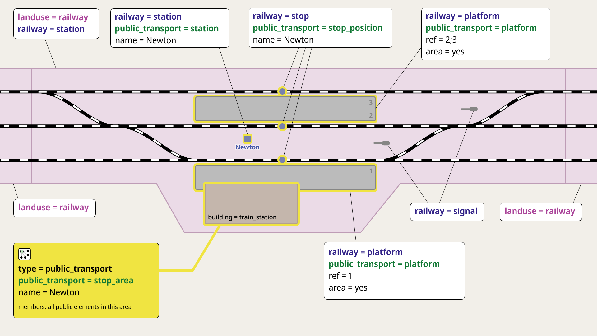
So what exactly is the fuzz about(?)… been mapping landuse=railway since longer, and when it fits, e.g. cutting it out of other landuses, particularly woodlands and then including the areas of the stations and halts in that. All I would need to do is carve up those railway landuse polygons, add the railway=station tag and I’m done, I think therefor… ;p
Of course grats on the pretty diagram… exactly representing but that 1 piece as I’ve been mapping it.
Something feels like it’s missings… the platform edge. Even had the JOSM validator tweaked for those that have more than 2 nodes (when the station is on a bend)
What about more complex station such as 2 line’s transfer station?
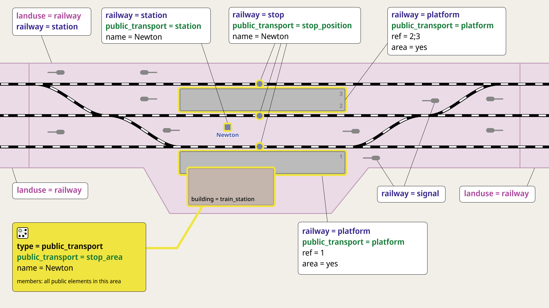
@onion42, I’ve left two signals in place, made them a bit smaller and less prominent. If everyone’s happy with that, I’ll be glad to keep it that way for the final version:
@stevea, as for the weeklyOSM — I was the one who added the news, but I was pleasantly surprised that the diagram was chosen as the headline graphics!
In the comments on my diary post about the diagram, @RedAuburn also suggested adding platform_edge, but I expressed some hesitation, as I feel it might make the diagram a bit overloaded. Now that @SekeRob has also brought it up, I’ll try to work on it and see how it could be shown in the next few days.
Thanks again to everyone for supporting my idea!
Speaking personally as a co-author / contributor to that diagram (and btw, @andygol and @darkonus should be added to its copyright notice on our wiki), I am astounded at the visual effectiveness of this collaborative diagram (the most recent, “balanced” one).
Visually, the diagram is an entire sentence, a complex one to be sure, of a dozen or so concepts (railway, landuse, public_transport, platform, where and how these “fit together” topologically…). The way that it uses color in both subtle and effective ways is, to my mind, like fireworks going off in my mind of understanding: the pink landuse=railway closely resembles how Carto renders this tag, the bold yellow conveying “this is a relation, a method our data uses to tie together related elements, and note the yellow borders around some of the key elements,” ah, I see (quite clearly) how the color green “ties together” the related key of public_transport and its various elements with specific values, the same for blue and railway… it is amazing. I keep staring at it, and can really feel how anybody else doing so will have the semantics of railway=station tagging (and placement / entry of nodes, ways and relations) leap into their mind of understanding.
The “larger context” of landuse flowing off the page as a “continuous” strip, while topographically isolating the “island” of landuse=railway + railway=station (and how the latter tag can and should rightly be on both a node and a polygon) is a real accomplishment.
I speak for myself, but this diagram really does leap from pixels on a screen right through my eyeballs quite directly into my brain’s synapses of understanding — it is that good. I would recommend that it become the replacement in our wiki (and a simplified version based on it be drafted like we already have for the older versions). I have an aunt who told me not to “beat my drum too loudly,” (boast of one’s accomplishments — “let others do that for you” she said), but of this diagram we can all rightly be quite proud.
Truly, this diagram is a real feather in the cap of OSM’s spirit of consensus. It is an outstanding example of what we can achieve together. I continue to listen to any further refinements we might make, but as it stands now, it is stunningly effective.
@onion42, I hear your concern — we want to avoid clutter — however, the signals are vital to delineate where the actual boundaries / edges of landuse begin and end for a railway=station. For stations with more complex tracking, this can and will get more complex, but the diagram is effective at connoting how a general case works of “signals define where a station begins and ends” as it simply generalizes for a “typical” station. I’d like to see the earlier version with full signals become a more-final version, please.
1 Like
How would you feel if I kept 5—6 signals but removed their color and kept them smaller in size, like in the latest version?
Well, the totality of them (ten signals), their placement, even their colors to denote how trains can safely enter and leave the station were all rather deliberately chosen from earlier versions of the diagram. I realize ten is a fairly large number, but with three tracks, three platforms and the method by which we have drawn two vertical lines to delineate the landuse=railway polygons (one without railway=station, one WITH that tag, a CRUCIAL element in what this graphic intends to convey), those signals — all ten of them — really are vital to define “where the boundaries are.” The diagram loses something without them, even with some opinions that they cause clutter.
1 Like
If they are separate stations from the railway infrastructure perspective (which is the case in most occasions), they should be mapped as separate ones. The two might be grouped with a public_transport=stop_area relation.
Thanks! I agree that the number and placement of the signals are important. As for the colors, I think they’re not that critical for what we’re trying to show — just an example of object tagging. So here’s another version: I kept the number and placement the same, but made the signals smaller and removed the colors:
4 Likes
Dang, we’ve really got something beautiful here!
I am doubting my own understanding here. If there was one thing I thought I had clear about railway station tagging, it was that one station should have only one railway=station object. I know there have been lots of discussions about whether that should be a node or a polygon, but I thought the discussion was in the context of “either/or, but not both”.
1 Like
It is a fact that syntactically you can see “both,” but the railway=station tag associated with landuse=railway is an “attribute-tag” (if I may coin that phrase to mean a sort of adjectival modification of a landuse=railway).
The other is the railway=station node, that tag and that tag alone, on an OSM primitive object, in fact our most primitive, a zero-dimension node, to indicate the “logical center” of not-especially-precisely where the station is. You want precise? OK, check the landuse=railway polygon: as the signal nodes constrain where this begins and ends (in the “greater context” strip of landuse=railway NOT tagged with railway=station). So, there really is only “one station object,” (the node), but it is more complex than that, as such stations “fit into” a larger context of landuse. And, thanks to this diagram “here is how.”
I hope that all makes sense.
1 Like
So is the proposal to remove the statement in the first paragraph of the railway=station wiki page: “There should be only one railway=station element for each station”?
Or is the argument that “landuse=railway, railway=station” is not a railway=station element? It seems that would require some careful drafting to make clear to the average reader of the page.
I thank you for the question, I thank you for striving for more clarity!
I think at least some confusion might arise from the fuzziness of what is meant by “element.” In the context of a relation, “element” means a certain thing. In the context of a (wide) concept like a railway station, a node element means something different than an adjectival closed-way (polygon) element (and than a relation element). In the context of how OSM tags (key-value pairs) can mean one thing “when alone” (as on a node, in this case) and another thing (adjectivally, to modify the “main tag” of landuse=railway) when paired with other tags, this means one thing for the node, and a different thing for the polygon. Calling the same semantic identical, (when one is on a node and alone vs. when one is a “modifier tag” on a polygon with at least one other tag) is not correct, even as their syntax is the same.
I realize this is subtle and indeed, we likely need better clarification of this subtle aspect in our wiki where can and should make such distinctions between syntax and semantics crystal clear.
I say that landuse=railway, railway=station on a polygon is a “certain whole semantic,” which is a different semantic than the single tag of railway=station on a node. Yes, this is a convention that must be understood (in the context of railway stations in OSM), and while I can’t think of one off the top of my head, there are other examples of this where we say that our tagging means one thing on a node, a different thing on a way (or closed-way polygon) and something else (perhaps) when in the context of a relation.
OSM is a relational database, where we lean pretty hard on sometimes subtle distinctions to bridge between syntax and semantics. Like natural language itself, OSM strives to be precise. But there are places and examples (like here) where we allow exactly the same syntax to mean slightly different semantics, given slightly different contexts.
I know, I know, there is a LOT of parsing (mental, syntactic…) required to fully comprehend how we tag to mean what we mean (so we say it how we say it). But as long as we document “here is how we say what we mean to mean what we say,” I think we’ll be fine.
And this diagram is like a sweet kiss of understanding for my brain. I hope yours finds it similarly.
In this version, I included the request to show railway=platform_edge on the diagram. To do this, I used smaller text labels and highlighted the ways and platform numbers in black. I also made the railway=signal label smaller:

This diagram now shows an even more complete tagging of a railway station, which is great. On the other hand, the diagram is starting to look a bit overloaded again. It might be better to leave out platform_edge here, especially since the wiki page for this tag already has several different diagrams for different situations.
It may indeed be possible to include platform edges, but only at the expense of making our “whole sentence” a bit of a “run-on sentence.” I don’t know whether it’s a good thing or not to say “too much” (and leave for another diagram / wiki page…) or to include this. “Even more complete?” Yes, perhaps. Too much? Perhaps again.
If we DO include it / this, I’d like to see the “text bubbles” all be outside the (pink) landuse polygon: I include the big platform one at the top, the little ones that overlap and fully overlay it, as well as the railway signal one. These detract from keeping separate elements with separate semiotic context well, separate. By “floating above” (the pink landuse railway) and partly stepping on it and being outside of it (the two bubbles for platform at top — and multipoligon isn’t spelled correctly) it really detracts from “separate elements conveying separate kinds of meaning should be separate.”
I will be away from this forum for about the next three to four hours and can’t be as interactive as right now. But the dialog is fantastic!
1 Like
This is a hard no from me. I see no point in going against One feature, one OSM element and using railway=station as a “secondary” tag (similar to covered=yes).
The railway=station area only appears in @darkonus’s illustration because it’s derived from @dieterdreist’s incorrect and undiscussed modification of https://wiki.openstreetmap.org/w/images/archive/3/39/20250203102140!Railway-station-tagging.svg. It seems like most of us would like to revert it to area:railway=station, but I would still like to hear @dieterdreist’s opinion on it.
Platform edge I’ve never mapped full around an area platform, only the side where the rail is, so if a platform area is between two binaries, there 2 edges with say 1 ref=2 and the other ref=3, the argument for this features existance as ref=2;3 does not tell which ride each is. Some have been cutting up the area into a MP and then tag the 2 long sides with ref=2, respective ref=3. Dislike that much.